Monday 26 March 2012

Colour cast and white balance

This exercise is similar to one carried out in the first section of my course, 'The Art of Photography'. We are examining the effect of the camera's white balance setting on the colour tone of a scene.

Colour temperature is measured in in units known as Kelvins and is related to the light that is radiated when a metallic incandescent light  source is heated to various temperatures (Hicks, 2005). The range of colours we go through is roughly red, orange, yellow, white and through on to blue. On the Kelvin scale the temperatures run from approximately 2000K to 16000k with neutral white light coming in at around 5500K

White is generally considered to be the visual standard and this can be found in the middle of the day. We are likely to find the lower temperature red (2000 - 3500K) in the early morning and late afternoon . A blue cast (7000K) can be found in the shadows on a sunny day, at dusk or in cloudy weather.

Also of importance is the colour temperature of indoor tungsten lighting which is around 2900K to 3500K, so in the orange/red area. For the sake of this exercise we will not include florescent lighting as this is not classed as incandescent light and can therefore not be measured in Kelvins.

Armed with this knowledge we can proceed with the exercise. The camera has settings for Auto, Shade, Cloudy, Sunlight, various artificial light sources and custom white balance. We are going to see how well some of these settings work for given situations.

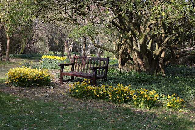
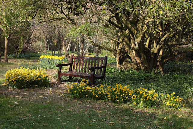
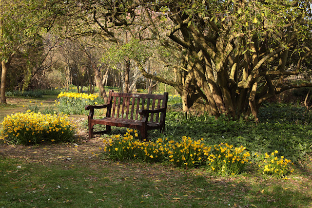
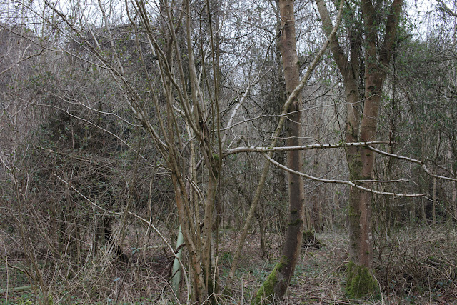
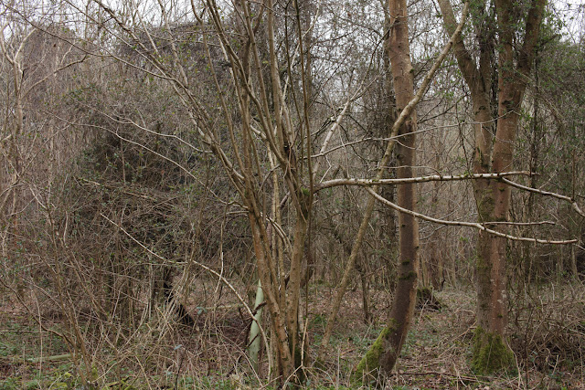
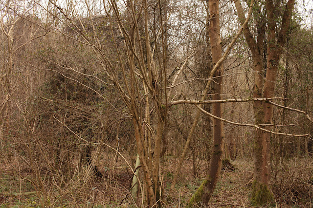
The first group of pictures were taken under sunny conditions. In this sequence the difference between auto and cloudy seems difficult to detect but both seem a little lighter than the sunlight shot. Maybe cloudy has added a little more exposure? The sunlight setting appears pretty close to how I remember the scene. The 'shade' white balanced version appears the most different. The camera processor has added orange/yellow to the image. The amount that has been added has made the image much warmer than the sunlight setting. This makes perfect sense. The camera has assumed that I have photographed something in the shade so has added orange/yellow to compensate for the blue cast mentioned above. Unfortunately I lied to the camera and the orange/yellow has been added to a normally daylight  balanced photo!

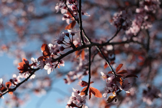
Auto white balance, F4 @ 1/ 2500 200 ISO.
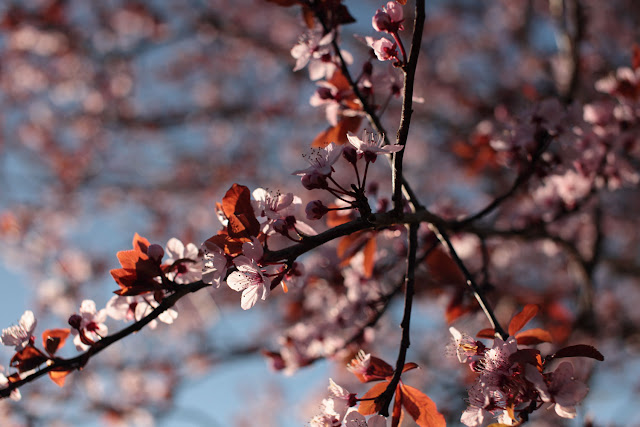
 Cloudy white balance, F4 @ 1/ 2500 200 ISO. 
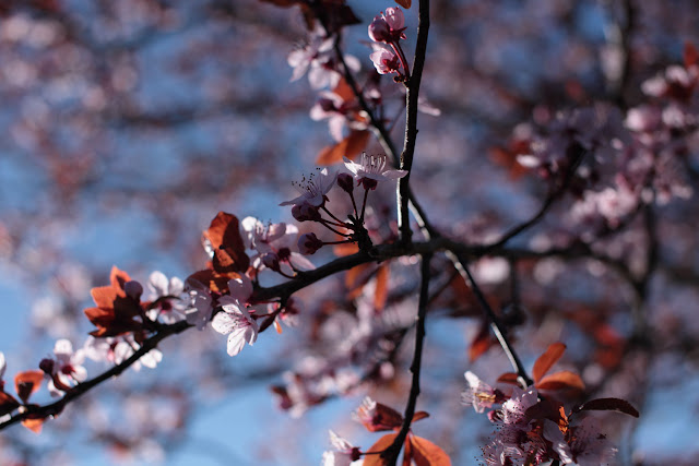
Sunlight white balance, F4 @ 1/ 2500 200 ISO. 
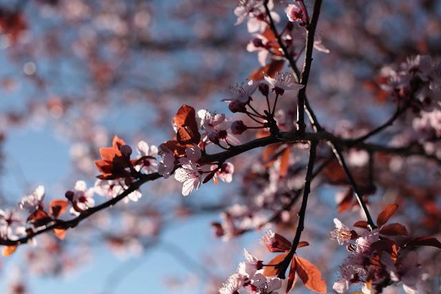
Shade white balance, F4 @ 1/ 2500 200 ISO.
The camera has mistakenly added yellow to compensate for the non existing blue cast!
The next group of images has been shot in open shade on a sunny day. The shade has been provided by trees. The first picture has been taken with the white balance set to shade. The colours are very saturated and the image is very warm - maybe a little warmer than I remember.

Shade white balance, F5.6 @ 1/125 100 ISO.
 The next shot is how the camera has seen it. This is radically different to the one above. The camera seems to have gone too far the other way and added too much blue. As I remember the shot it sat between the two. If I had to make a choice though, I would choose the top image.

Auto white balance, F5.6 @1/125 100 ISO.
The following image has been taken with the camera set to sunny white balance. On my camera sunny is actually referred to a daylight. We know that daylight, or midday is considered the yard stick by which the temperature is measured so I am expecting the camera to not make any adjustment here. This image appears to sit half way between the auto setting and the shade setting, much as I remember the scene. Perhaps my 'open shade' wasn't shady enough and the shade setting has added too much orange to the scene?

Sunny white balance, F5.6 1/125 100 ISO.
The final image in this sequence is using the cloudy setting. I am expecting the camera to add orange to compensate for a blueish cast and believe this is what has happened. This has warmed the image just past the sunny and auto settings. Again we have very saturated colours.

Cloudy white balance, F5.6 1/125 100 ISO.
The final sequence of images were taken in cloudy/overcast weather. Admittedly not the best of pictures but funny how all the clouds disappear when you need them! I have started this sequence with the cloudy white balance shot. This is a pretty accurate rendering of how I remember the scene.

Cloudy white balance, F8 1/40 200 ISO.
Compare this to the cameras auto setting. Again the auto setting is radically different from the setting above! This shot is much too cold!

Auto white balance, F8 1/40 200 ISO 
Daylight white balance (below) is a little better than auto but still too cool.

Daylight white balance, F8 1/40 200 ISO 
 And finally the shade white balance has warmed the image up too much. The colours are now too orange.

Shade white balance, F8 1/40 200 ISO 
This exercise has not only shown how the camera settings can vary and that one has to be careful about setting or choosing the white balance but also how the white balance could be deliberately set in a manner that may not faithfully reproduce the colours but could be used for creative effect. There is also a noticeable increase or decrease in saturation under different white balance settings. Also worthy of note is the fact that when viewing the images in isolation it is not always quite so obvious that there may be a colour cast present.

I shoot RAW all of the time and this is one reason that makes this worthwhile. The white balance can be tweaked in software after the shot has been taken. On important shoots I have also started using a grey card  for the same reason.

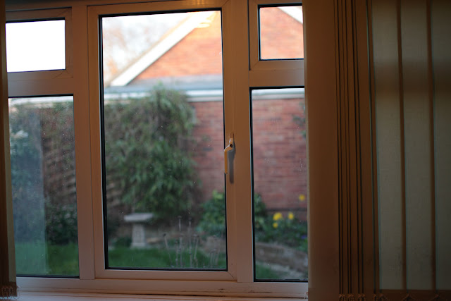
The final part of this exercise asks us to compare settings for an image shot partially in natural light and incandescent light. To make this picture I shot from within a room with the light on through a window to the natural light outside.

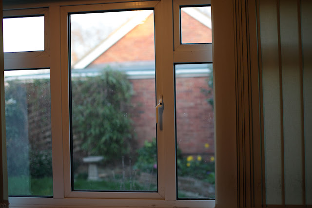
Auto white balance, F1.8 1/60 100 ISO.
 Above, auto white balance seems to have opted for the outside. The tungsten lighting is rendered in an orange colour.

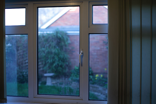
Daylight white balance, F1.8 1/60 100 ISO. 
 To prove the point that the auto has settled for daylight white balance, this is the daylight setting. Very similar to the photo above, maybe a little more orange.

Tungsten white balance, F1.8 1/60 100 ISO. 
Finally with the white balance set to tungsten, the indoor lighting has been rendered in a more natural colour. This is at the cost of the view through the window which has now taken on a blue cast. In this situation it would be very difficult to satisfy both conditions in camera and a compromise would have to be made.

Pushed to make a choice, I think I would choose the daylight balanced version. There is no main subject to focus on so it is purely a matter of what feels right. I like the warm interior and natural lighting on the other side of the window and can identify with the colours this way. I feel there is little difference between this and the second shot but that the tungsten balanced photo is too cold.

Sources:
Hicks, N, "The photographers guide to light", David & Charles.

Don McCullin, Shaped by War

I managed to fit in a trip to the Imperial War Museum in London last week. The purpose of the visit was to take a look at the Don McCullin exhibition ‘Shaped by war’ before it closes in mid April of this year.

The exhibition is somewhat chronological and begins with early work consisting of local gangs in Finsbury Park. It then moves on to more political photojournalism including the setting up of the Berlin wall and events in Northern Ireland. The images are mainly in Black and White which drives the gritty subject matter home.

The exhibition then continues with areas of conflict and finishes with some of Don’s non conflict and later work. A nice touch is how the background walls change colour from dark, as they are in the conflict areas, to light for the other works.

In several places it is mentioned that Don does not call himself a war photographer, concentrating more on the effects of war on the victims. This is evident in many of the images and indeed gained Don  ‘World Press photo of the year’ (1964) with "A Turkish woman mourns her dead husband, a victim of the Greek-Turkish civil war".

Also of particular interest are the post-it notes plastered over the iconic image ‘Shell-shocked US marine, Hue, Vietnam, February 1968’  with instructions on how to print the photograph. Various items of equipment used on some of the assignments and of course Don’s shot up Nikon camera are also on display.

The imagery is interesting, captivating and in some places shocking.

As an aside there is also a second exhibition running at the IWM. This is work by photographer Ori Gersht  (born 1967, Tel Aviv), the exhibition being entitled ‘This Storm Is What We Call Progress’. The imagery deals with conflict, history and geographical place (IWM).

In this series of images Gersht experiments with digital noise, a subject particularly relevant to this part of the course.

Sunday 18 March 2012

Noise

In this section we are examining digital noise. Digital noise is often compared to grain in film but in fact the two are not the same. Digital noise is a sampling 'error' which can and often does result in the degradation of part of the image. Film grain is a necessary part of the chemical process that is developing and printing film.

Influencing factors on digital noise are the length of an exposure or a high ISO setting.

Prior to this exercise I have looked at the images 'Grey Texture' and 'Turkish Dance' in the Key Resources section of the student web site. This goes to show that distinguishing noise from a real pattern can be difficult as well as subjective.

To carry out this exercise I have set my camera to aperture priority and carried out a little test to make sure my slowest shutter speed is no longer than 1/2 a second. I settled on an aperture of F8. The camera was mounted on a tripod and I set up a house-plant with some white foam board as the background. I made sure the white foam board was in the shadow.

I then started shooting the same setup from my lowest aperture which is 50 ISO to the highest which is 25600. The ISO range I went through is as follows: 50 (L), 100, 125, 160, 200, 250, 320, 400, 500, 640, 800, 5000, 6400,  12800 (marked as H1) and finally 25600 (marked as H2). L, H1 and H2 are classed as ISO expansion in the camera manual (Canon EOS 5D MKII) and are not normally available unless a custom function is set.

Here is the 50 ISO image which will be the least noisy.

50 ISO F8. The lowest noise image
To make the details easier to see I have zoomed in to 100% on an area that shows both background and the foreground subject.

Detail from the 50 ISO image above.
We can assume a steady increase in noise as the ISO gets higher. Just to make it easier to see, lets compare the same detail in this shot to the highest ISO picture which is H1 (25600 ISO is ISO expansion. The normal highest ISO would be 6400).

Same detail as above but at 25600 ISO.
When comparing the two in this manner it is easy to see the degradation in the second image. The plain back-ground is now suffering from a lot of blocks of pink/purple and blue/green and no longer appears as a smooth, plain colour. The green stem is showing the pink/purple blocks more than the green with the latter presumably being swallowed up by the green of the stem. The pink of the flower is being disrupted and is showing mainly blue noise.

This noise is at its most extreme when using ISO expansion. When you look at the same section at 6400 which is the camera's normal top ISO setting, things are considerably better. The coloured noise is still evident in the background but the flower and the stem are a lot cleaner with the noise not so apparent. The main difference between this photo and the first 50 ISO version is that in this image the detail does not come across as being quite so smooth.

The petal at ISO 6400, the normal top ISO for the Canon EOS 5D MKII.
The final image I have added is at ISO 800. Things are again a lot smoother than the previous shot and I would say this is perfectly usable under normal circumstances. Compare the edges of the green stem and the smoothness of the background to the 6400 ISO version. Note also that the petal does not seem to be that different. 

ISO 800. Perfectly usable under normal conditions.
Examining the rest of the pictures shows a gradual increase in quality as we move nearer the 50 ISO. Once below 800 ISO the differences become so subtle that it is sometimes difficult to spot the reduction in noise on a picture by picture basis.

I think that the noise may have shown up more prominently had I had a darker shadow area judging by the effects of noise on the dark stem of the plant.


Saturday 10 March 2012

Untitled, Dungeness 2012

Untitled, Dungeness 2012 by SimonLawrence
Untitled, Dungeness 2012, a photo by SimonLawrence on Flickr.
A little more experimentation with film, this time using my Canon 30V. This was set for a multiple exposure and didn't quite work as planned but I still like it. The film was then developed in a home-made Coffee developer and scanned to the computer. This is the actual colour of the negative as it started life as a colour film. More examples of colour film developed in Coffee can be seen on my Flickr photo stream (click on the photo to get taken there).

Highlight Clipping

To start this exercise I have taken five exposures of a contrasty subject. The first photograph was exposed to get just the slightest amount of highlight alert showing on the camera LCD screen. The second shot was a stop more exposed than this. A further three images were then taken at one stop, two stops and three stops under the initial exposure.

P1. The base image showing the area where the highlight alert has started to flash on the camera.
(ISO 100, 1/160 @ F5.6 105mm. The image has had no processing done other than a RAW conversion to JPG.)
Below are the five shots, cropped to just the area where the highlight alert was activated.

P2. The base line image.
The base image (P2) shows just a little highlight clipping along the edge of the gutter (In the area indicated in P1). The gutter is still rendered in a satisfactory manner though. Very nearly all of the image information is still present along the side of the gutter and it is clear where the shade changes to darker on the edge of the vertical section.  There does not appear to be any colour cast and the overall image saturation is good.

P3. Base line + 1 stop.
Next up, Image P3 which is one stop over the base image. This has noticeable data loss. The side of the gutter appears as one long white strip. Branches of the tree in the background have disappeared completely and in the top left of the image the sky virtually blends in to the background white. There appears to be blue fringing around the top of the roof tiles and a possible band of fringing along the top of the gutter. The whole image is less saturated than the base image.

P4. Base line - 1 stop.
At one stop under the base image (P4) we have regained the saturation and detail in the sky and gutter. In fact the saturation is greater than in the base image. The blue fringing is no longer apparent along the roof tiles - perhaps it has merged back in with the blue of the sky. There is still information in the dark areas and this would in my opinion still make an acceptable image.

P5. Base line - 2 stops.
 P5 is starting to go too far the other way. We are starting to lose detail in the roof tiles and although the gutter is still clearly defined it appears that a darker fringe is starting to appear where the gutter meets the roof tiles. The image is very dark and we seem to be losing the range of tones we had in the base image.

P6. Base line - 3 stops.
The final crop (P6) has lost a lot of detail to the dark areas. There is definite fringing along the top of the gutter with a red/purple colour cast. Darker areas have completely blocked out and the area that initially had a highlight warning is about the only area left with some white showing.

At this stage I think I would be happy to accept the base image or image P4.

For the second part of this exercise I am going to process the image using the recovery sliders, which are called simply 'Highlight' and 'Shadow' in the Canon RAW converter.

In practice I found that the controls in the Canon software did not offer the range of adjustment that other software offers. On the bright side this does encourage accuracy at the time of taking the picture! To complete this exercise I switched to Adobe Lightroom, my version being 2.7.

Starting with the base image I turned on the highlight indicator and adjusted the recovery slider. At +19 the red highlight alert had completely gone. I did this several times paying attention to the rest of the image. Interestingly the base image has a larger area of highlight alert in Lightroom than it does in the Canon RAW converter. We must be seeing software differences in the way the linear data capture is being translated. When adjusting the recovery slider, our original warning area is the last to disappear.

Moving on to the second image (P3) which was exposed at +1 stop. This image has the whole sky coloured red as a clipping warning. The recovery slider has to be moved all the way up to +34 to lose the alerts. On this occasion all the red disappears at almost the same time. Even when all the clipping has been eradicated,the image still looks over-exposed.

On the final three pictures, there was no highlight clipping as they were under exposed. I still played with the recovery slider to see what effect it would have. It was noticeable that the lighter areas such as the sky were affected and became darker whereas the foreground wooden fence stayed very close to it's original exposure.

I checked the rest of the image for noise and digital errors and to be fair to Lightroom, I found virtually no evidence of this. What I did see is that the transition from dark to light happened more quickly when I ramped up the slider. This was apparent in areas such as the side of the gutter.

Here is the edit I chose as most favourable. It is 1 stop under the base image and didn't need any adjustment either way. There is detail in the shadow areas and the highlights were not clipped.

The final choice. 1 Stop under the base image.