Using what I have learnt in the previous exercises I have been photographing some high contrast scenes. The objective is to get the images right in camera and for this reason none of the images have been edited bar some resizing. The camera was set to Jpeg.
I have photographed four different scenes with three images per set-up.
Strong incident dappled light
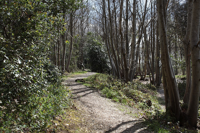
Picture 1. For this I went to some local woodland to photograph in dappled light as suggested by the work book. I used a tripod with the camera set on self timer. White balance was set to auto
for all three of these shots. This was unintentional. I usually set the white balance to auto when I shoot RAW and use a grey card or something white to set the white balance in post processing, so completely forgot to set it to something more appropriate!
So, the challenges I faced were to get a good overall exposure from these darks and lights. This was made more difficult by the changing lighting conditions. The sun was just a little to the right of the shot and I see from the EXIF data that the time was 10.30 in the morning.
 |
| P1. 1/30 @ F11, 50 ISO, spot metering, AWB, 35mm. |
To reproduce what I saw I decided to use spot metering and took readings from the bright part of the path (1/60 @ F11) and the shadows on the path (1/15 @ F11). This gave me a two stop difference so I opted for the middle ground and set the camera to 1/30 @ F11 and took the shot. I was expecting the camera to give me some detail in the darks and not burn out any highlights. The resulting picture was pleasingly close to what I was expecting albeit a little flat.
I think the picture could perhaps be improved it it were 2/3 stop darker which would give a bit more saturation to the greens. Maybe it would also have been better with the white balance set to 'shade'. As we have seen in '
colour cast and white balance' exercise, the shade white balance would have warmed the shot up some more.
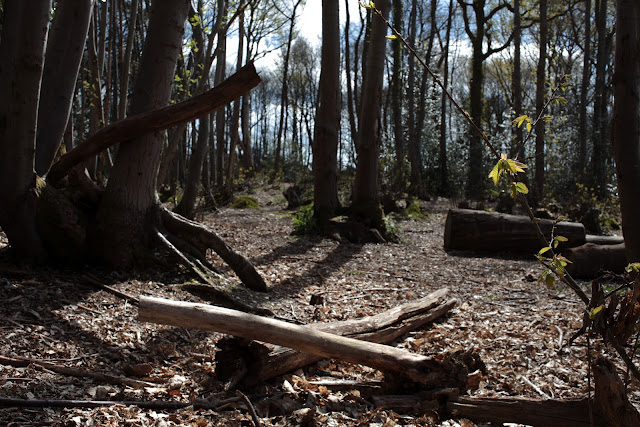
Picture 2. The second picture was taken in a different part of the woodland. The orientation is also a little more into the sun. The challenge this time was the higher contrast and in particular the very bleached log against the shadow area of the nearby tree.
For this image I again used spot metering. This time I didn't average the exposure but instead tried to pick an area that I though was the 'exposure' middle ground, as it were. The area I picked was the darker patch of leaves between the two crossed pale logs.
 |
| P2. 1/60 @ F11, 50 ISO, spot metering, AWB, 35mm. |
This shot has come out a lot more contrasty than I remember. I was careful to avoid burning out the very pale logs in the foreground but still thought there was going to be more light in the scene. I do see though that the exposure is correct for the area that I chose to expose for.
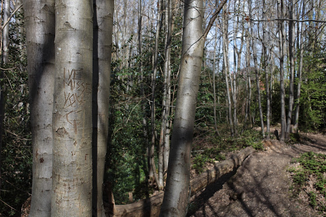
Picture 3. The final shot for this set. The exposure was again measured using spot metering. The area I decided to expose for was the bark of the tree near the carved names. I chose this as it appeared to be close to a mid grey and believed the camera would expose this correctly. Also, it was neither in deep shade or in bright light.
 |
| P3. 1/100 @ F8, 50 ISO, spot metering, AWB, 35mm. |
The camera has coped well with this shot. There are some dark shadows but on the whole it is well exposed. Note that the light is coming from the left and behind the camera. Overall this shot is very close to how I saw the scene and how I expected the camera to render it. The only thing lacking is the 'warmth' I may have got with the white balance set to shade.
A backlit scene
I initially set out to a local parish church to capture scenes for the 'indoor space with natural light' section of this assignment. While I was there I spotted opportunities for the 'backlit scene' part as well.
The conditions were bright but diffused. It had been raining earlier in the day. I was carrying three prime lenses, a 35mm F2, a 50mm F1.4 and a 85mm F1.8. I was also careful to remember to set the white balance this time! I did not use a tripod for the following images.
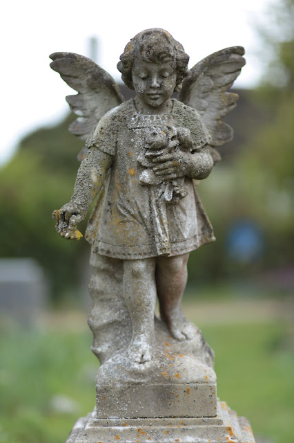
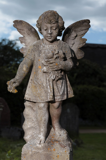
Picture 1. I spotted this statue grave marker as I wandered down the path towards the little church. Aha, backlit! Naturally this picture could only be taken from the one direction and to get a good shot of the angel's face I needed to be at a low angle shooting up. This would bring in the sky behind the angel's head. Another challenge was the chimney behind the angel's left wing.
I set the camera up in daylight light balance as it was not cloudy or in the shade. I then took a spot meter reading from the angels face. I deemed this to be close to a mid grey and wanted to expose for this. I had a hunch that the dynamic range of the shot was going to fall outside the camera's capabilities. Of course I could have measured this with the camera's spot meter like in the previous exercise. Ultimately though, this exercise was about knowing your camera and adapting your shot ideas to fit, and I wanted to expose for the angel's detail at the cost of the background. I was pretty sure the camera was going to overexpose this.
 |
| P1. 1/800 @ F1.8, ISO 100, Spot Metering, Daylight WB, 85mm. |
The camera's spot meter was perfect in this situation where I have a clear area to measure - with a good average tone and low reflectivity. The camera does seem pretty good at exposing under these circumstances.
This is how the camera interpreted the shot. It is very close to how I saw it. I used and aperture of F1.8 to reduce the depth of field to a minimum. This has helped with the overexposed background by blurring everything behind the angel into one.
Picture 2. The next shot is of a sarcophagus in another part of the cemetery. Again this is backlit (but at ninety degrees to the previous image). I again used spot metering and metered of off the grey area in the centre of the sarcophagus.
 |
| P2. 1/1000 @F4, ISO 400, Spot Metering, Daylight WB, 35mm. |
The camera again delivered what I was hoping for. The spot metering seems to be pretty good providing you take your meter reading from the correct area. I have been reading Michael Freeman's 'Perfect Exposure' which has made me stop and consider exposure situations more carefully when taking a shot.
Picture 3. The last photograph in this set of three was taken with the same orientation as the one above. For this shot I decided to use evaluative metering as I felt the overall tonal range was not as great as some of the other shots. Although this shot is backlit, the frame is now dominated by the foreground subject.
 |
| P3. 1/100 @ F8, ISO 400, Evaluative metering, Daylight WB, 35mm. |
I am really happy with how the camera handled this shot as I imagined that bright background patches would get rendered between the leaves of the dominant tree and in the area in the centre of the frame.
I think it is worth mentioning that all three shots were taken with the camera set to manual exposure and the exposure was set to the camera's recommendation.
Indoor space with only strong natural window light
The next three photographs were all taken inside the chapel. In many ways these shots face similar difficulties as the first three. My biggest problem here was always going to be the windows. As the dominant light inside seemed to be the light coming from the windows, I kept the white balance on daylight. I did take a shot after the initial three with the white balance set to shade and think that the daylight pictures resemble the actual scene more accurately.
Picture 1. The font image was actually the last of the three images from inside the chapel. This was slightly different to the other two as I deliberately tried to include the windows in the other pictures but not in this one. I took a spot metering from an area of grey near the bottom of the legs of the font. Of note is the fact that there is another window to the left of the font lighting this area.
My biggest challenge here was keeping the camera still as I did not have a tripod with me. This was overcome by upping the ISO to 400. I thought the white balance was going to be an issue but this turned out not to be a problem with the daylight setting rendering the colours quite accurately.
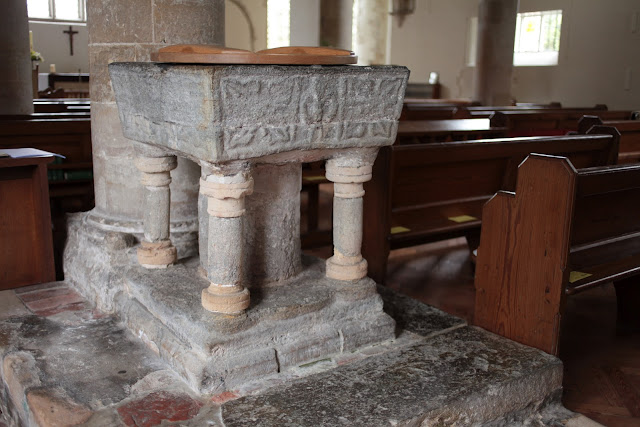 |
| P1. 1/100 @ F2, ISO 400, Spot Metering, Daylight WB, 35mm. |
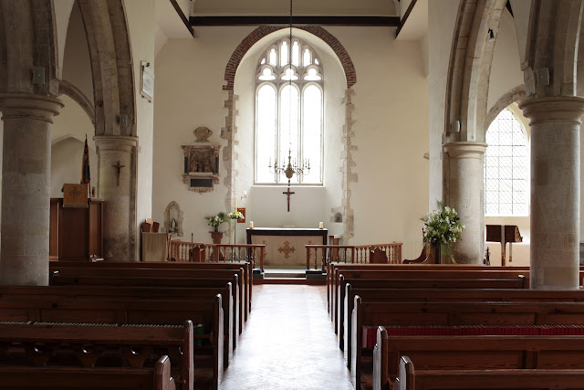
Picture 2 & picture 3. The following two images are similar in the challenges they present. It is obvious that the range is going to be too much for the camera, with the light streaming in through the windows on one hand and the darker interior. A choice had to be made what to expose for and I decided on making the interior the main subject.
 |
| P2. 1/15 @ F5.6, ISO 400, Spot Metering, Daylight WB, 35mm. |
For both of the shots the challenge was also going to be picking the right area to measure exposure to get the desired effect. I have found that generally I have more success using spot metering, so this is what I have used again. By success I mean getting the camera to expose the scene how I see it.
For picture 2, I took a spot reading from the pillar nearest the altar on the right hand side (near the flowers). I was hoping for a well exposed interior but without too much burn-out in the window area. The pillar I metered from appeared to sit nicely in the middle of the exposure range. The camera did give me pretty much what I was hoping for with one exception. The floor is brighter than I saw it. I think the camera has picked up some of the reflection of the light coming through the window. I didn't see that as quite as bright as the camera.
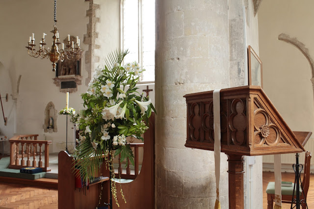 |
| P3. 1/8 @ F8, ISO 400, Spot Metering, Daylight WB, 35mm. |
In shooting picture 3 I used the same pillar to set my exposure. Here things were a little easier as the bright window is partially obscured by the pillar. Due to this and the angle of the shot the contrast is less than in picture 2.
I am very happy with how the camera has rendered this image. There is minimal burn-out in the window and all the surrounding objects are well lit with nice detail in the shadows.
Indoor scenes illuminated by a single source of artificial light of high luminance
For the light source in this series of images I used my desk lamp. I wasn't completely sure what was meant by an 'indoor scene' so I interpreted it as objects lit by the lamp.The lamp is fitted with a daylight bulb so I have used daylight for the white balance setting.
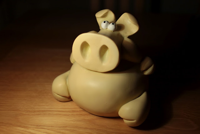
Picture 1. With the camera tripod mounted I set the figure up on the table. Things to consider were the brightness of the lamp forming a localised hot-spot. This figure is not at all reflective so I chose something more reflective for the next image. Another important point known from the outset is that it would not be possible to capture the entire range of brightness but in this situation we may have to be aware of noise in the darker area's.
 |
| P1. 1/40 @ F2.8, ISO 100, Evaluative Metering, Daylight WB, 35mm. |
I chose evaluative metering for this set of images, relying on the camera to set a good average exposure. I was also careful to exclude any of the bright parts of the lamp from the shot.
I did see this scene lighter than the camera recorded it and the colour temperature was slightly cooler - my daylight bulb must be a different temperature to the camera's daylight setting. It looks like the evaluative metering has metered for the light area that makes up about two thirds of the picture.
Picture 2 & 3. Pictures two and three are of the same subject for reasons to be explained below. As I noted earlier, the subject for picture one was very matt and I wanted to try something reflective under the desk lamp. I found these decorative silver coloured objects and set them up on the table. Again I used evaluative metering. There were some clear bright spots on the edges of some of the ornaments as they were very reflective and the lamp was not very far away.
For the first shot, I felt that the camera dealt reasonably well with the scene. There was some clipping showing on the camera display though. As suspected the bright edges had fooled the camera.
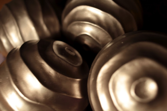 |
| P2. 1/4 @ F4, ISO 100, Evaluative Metering, Daylight WB, 35mm. |
I adjusted the shutter speed and took pictures of the same scene until the highlights stopped clipping. This resulted in 2 1/3 stops less light. Picture 3 below is the scene without clipping.
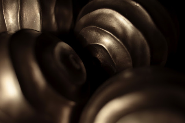 |
| P3. 1/20 @ F2.8, ISO 100, Evaluative Metering, Daylight WB, 35mm.
|
It is interesting to note that you can see almost just as much of the ornaments, just that they are now darker. By this I mean that the shadow areas have not grown in size.
Part Two.
To work on the reducing the contrast I have selected my second set 'A Backlit Scene'. I found this an interesting situation due to the number of different ways of bringing the contrast down.
The first and most obvious choice is to select a day with less bright weather. A good cloud layer would help to diffuse the light and a miserable day would also help reduce the contrast. In a similar vain we could also alter the time of day so that the sun is in a different position or lower in the sky.
Other methods include using fill in flash or a reflector, although the reflector may work on the angel statue but may not be so effective on the two larger scenes.
Changing the composition is a further option, although this may not always be possible. Finally, one could do something in software by using an HDR package or taking various exposures of the same subject and marrying them up in a photo editing package, picking the best exposure for each range of exposure.
Picture 1. I returned to the church yard with some tools to try and lower the contrast. Fortunately it was a fairly bright day again, so the conditions were similar to the first visit. The tools I took were a reflector and a camera speed-light. I had intended to use the reflector for the statue, the other area's being too big to light with the size of reflector I had.
I set up the camera on aperture priority so that I could shoot with the camera in one hand and the reflector in the other. Due to the angles and the brightness of the background, I wasn't able to get enough light on the statue to make a big enough difference to the contrast, so I changed my plan.
I set up my flash unit on a light stand and reset the camera to manual. The shutter speed was set to 1/200th, my camera sync speed. My flash unit was set to full power and the radio triggers connected. I took a small number of pictures just to get the aperture value that looked best.
 |
| P1. 1/200 @ F11, ISO 100, Spot Metering, Daylight WB, 85mm. |
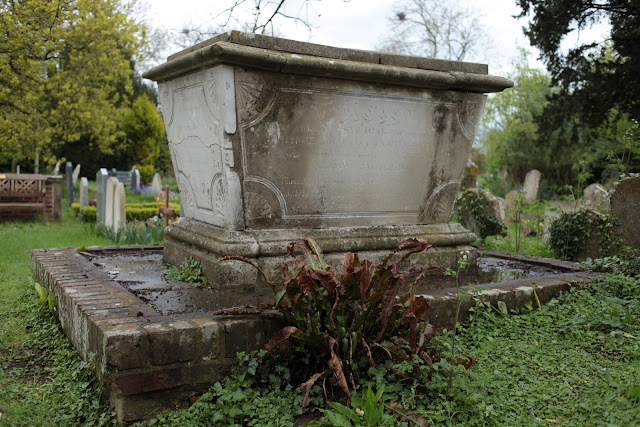
Picture 2. This shot was intended to be taken with the flash gun at the planning stage as I did not believe my reflector would be big enough to light the whole tomb. The flash was set up on a stand to the right of the camera. I took a spot reading from the sky and tried to get as close as possible to this with the flash settings.
The white stone tomb is very reflective which helped and I ended up using F11 to get the shot below.
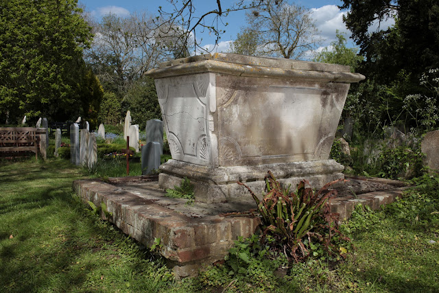 |
| P2. F11 @ 1/200, ISO 100, Spot Metering, Daylight WB, 35mm. |
Picture 3. The final shot was a revisit to the gate. Again, I had planned this as a flash shot for the reasons mentioned above. Again with the flash set to full power, F11 gave me the lighting below. It is slightly more difficult to see but the sky is now blue and not burnt out like in the first picture of this scene.
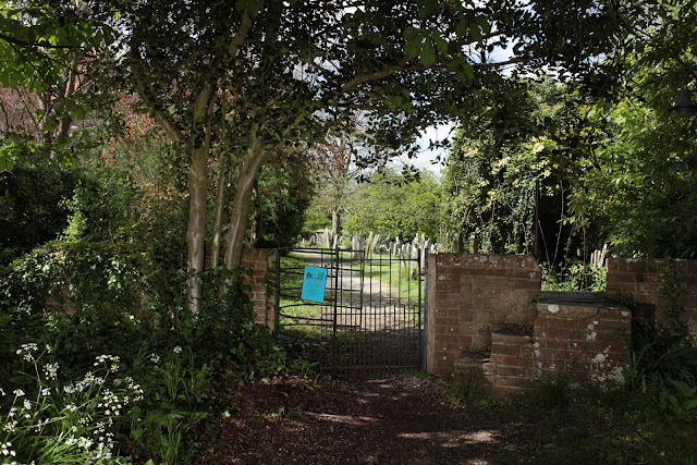 |
| P3. F11 @ 1/200, ISO 100, Spot Metering, Daylight WB, 35mm.
|
Conclusion
This was an interesting exercise to perform. It did slow my picture taking right down and force me to consider the conditions much more carefully. Coincidentally I am reading Michael Freeman's 'Perfect Exposure' at the moment which has some useful chapters on viewing the scene as a collection of exposure zones. This helps you to think like your camera to a certain degree. I must confess to still liking the spot metering mode for accurate exposure but have now found some merit in using the evaluative mode in scenes where the overall dynamic range appears to be low.
Ref: Freeman, M, "Perfect Exposure", ILEX.


