This exercise is about processing images. The photograph I have chosen is one I took on a recent trip to London using my Canon film SLR and a 35mm lens. I was using normal ISO200 Kodak colour film - in fact rolls that are available from pound land at £1 a roll! What really fascinates me about the film camera is that it has the option of taking multiple exposures. As it is on film, you really take your chances as to whether you end up with an interesting picture or not. On this particular visit I ended up with half a dozen usable pics.
The film was sent of for developing and I received the negatives back through the post without prints. I then scanned the negatives into the computer with no adjustment on the scanner other than selecting a film type that was close to the film I used. The resulting images were large tif files. Below is the image I started with.
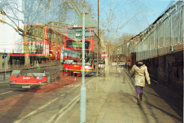 |
| Before. Scan from 35mm colour film to Tif. |
Above we can see the image as it came from the scanner. Its not too bad but there were certain colours and tones I wanted to adjust. The tones that caught my eye when I took the picture were the red of the bus against the blue of the sky and brown pavement. The white building in the top left hand corner bothered me but this could not be cropped as it would cut into the bus and ruin the composition.
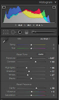 |
| LR4 Settings. |
I set to work in Lightroom. First I switched on the highlight and shadow clipping warnings and adjusted the exposure down a bit. I did not adjust the white balance - I had used a daylight film and I liked the colours in the image.
Light-room advises that you start at the top of the settings and work your way down, so this is what I did. I adjusted the contrast to give a punchier picture (for a detailed view of the settings click on the LR4 settings image). I then adjusted the highlights, shadows, whites and blacks to eliminate any clipping warnings but also make sure there were some decent blacks.
A tiny bit of clarity and vibrance just added a little sharpening and mid tone punch.
What cannot be seen in the settings panel is the next step. Some localised processing was required, so I added a graduated filter running from the left hand edge to roughly a third of the way in. This was set to exposure and at a negative value to bring the white building down a bit. The same was done from the bottom of the image to approximately a quarter of the way up to lead the eye into the lighter centre of the frame.
Finally, I straightened the image a tiny amount and then cropped a little of the bottom and the right hand side. The resulting image can be seen below.
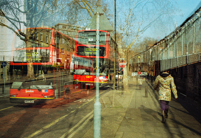 |
| After processing in Adobe Light-room 4. |
Admittedly this wasn't a RAW conversion but the steps I would have took, would have been exactly the same. Likewise with a Jpeg. Some might also say that the colours have been pushed too far but I think this really makes the image stand out. Maybe it has a touch of the Martin Parr about it!


