Friday 29 June 2012

Black and white

For this post I am not going to talk about the processing of the image as this was done in much the same manner as the black and white processing in previous exercises.

This shot was set up with two camera flash guns fired by radio triggers placed to the left and right of the fruit bowl. The bowl is filled with a variety of different fruits each with particular textures. To add further interest to the shot, the bowl itself and the table introduce further textures.

1/250, F4, ISO100  37mm.
By choosing the fruit and the table, I am trying to emphasize the qualities of line, shape, form and texture. There is textual variety between the plumbs, peach and lemon skins. For line we have the edges of the table and the grain in the wood. The round shapes of the fruit are good solid primitive forms that are well defined by the contrasty unmodified light. The varying secularity of the different fruits also helps to define form. The light rim of the bowl near the bottom edge of the picture is contrasted against the shadow cast by the same.

I think I maybe should have framed the shot a bit tighter - I have already cropped it down to lose some distracting features in the background. Exposure in this situation is partially dictated by the use of the flash units.

Monday 18 June 2012

Colours into tones 2

In this exercise I have attempted to increase the 'depth' of a photograph by working on the tonal range of the skies. The workbook suggests that I take a landscape photograph but as the weather has been so bad, I have had to select an image from my existing captures. The picture I have chosen does have the characteristics that I would have aimed for, i.e. a wide angle shot with a good sky and some foreground interest.

The first image serves as a reference image. This is a straight conversion to black and white in the software with default settings. The end result is again a fairly flat image. The blackest blacks are not totally black although there are some proper whites.

Here is the default conversion...
A default conversion by the software.
To create a more interesting shot and one that fulfils the brief, I have started with the default conversion and further worked this. After some initial tweaking of the contrast and blacks and whites to enhance the image, I set to work on the skies.

To create the depth I really needed to draw the eye to the sky area and emphasize the cloud layers. Most of this was achieved by working on the blue and aqua sliders. After some adjustment I was able to return to the exposure slider to brighten the image back up again. This allowed further tweaking of the image.

The end result can be seen below.
Conversion to emphasise depth.


Much as in the previous exercise, I was able to push the processing a very large amount. We are again deviating from reality but in black and white this seems more acceptable.

Thursday 7 June 2012

Colours into tones 1

The original image used in this exercise was taken with my film camera and colour negative film. I then scanned the negative into the computer which resulted in these lovely vivid colours. This provides the perfect tonal range for this experiment where we will be lightening and darkening the grey scale tones of the dominant colours, in this case, blue and yellow.

The original image.
Before starting work on the individual colour tones, I have carried out a standard black and white conversion using the software defaults. The software conversion is very safe but not very exciting and can be seen below. This will serve as our reference image.

A standard black and white conversion by the software.
The first edit (below) emphasises the yellow tones and subdues the blue areas. As can be seen by the inset settings panel, several sliders have been adjusted to maximise the effect.  Yellow, green and orange have all been  reduced to darken the yellow tones. The blue and aqua have been increased to maximum to lighten the sky area. The resulting image can be seen below. It has been necessary to adjust more than just the main colour as different shades start to spill over into other colours.

Darkened yellow tones.
To reverse the tonal range from above I have now minimised the blue and aqua controls and increased the yellow and greens. This has produced the strong 'negative', almost 'infra-red' style image below. Note how the sky area in the image above is much larger than the equivalent dark sky area below. In both conversions I have tried to get the contrasts as extreme as possible without losing any detail. I have allowed a tiny amount of clipping in both the blacks and the whites.

Darkened blue tones.
Conclusion.
Creatively there is a major difference between these two images. The image with the darkened yellow tones is maybe a little extreme but nether-the-less still a realistic black and white rendering of the original. The picture with the darkened blue sky is abstract and surreal. Here we have changed the meaning of this image from an unusual view of a group of trees to something other-worldly.

Wednesday 6 June 2012

Hotel room.

Hotel room. by SimonLawrence
Hotel room., a photo by SimonLawrence on Flickr.
Some time ago I looked at the artist Stephen Shore. I am interested in his 'deadpan' style of photography. Here is one of my attempts to photograph in the same style.

The picture was shot on 35mm film in natural light, hand held. The location is a hotel room in Gent, Belgium.

I am very happy with the shot. I love the colours which are pretty much how the camera took them. I am aware of, and don't really mind about the burnt out window.

Strength of interpretation

"The removal of the element of colour, and with it the implication of reproducing reality, has a useful and interesting effect on processing". So says the exercise book. In this task we are going to experiment with this idea and see what differences there are between processing a colour file and the same file in black and white.

I am going to process two of my files, one that I feel suitable for a high contrast treatment and another for a high or low key treatment.

The first image of a graffiti artist in Belgium has been given a very high contrast treatment.This was achieved with curves in an 'S' pattern suggested by the work book. I set the contrast so high that we lose some detail in the darkest blacks, the artist's trousers, and also in the highlights. This is easiest seen in the artist's fore-arm.

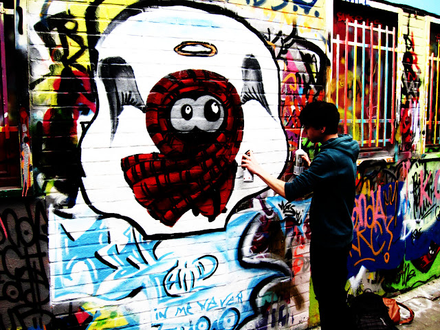
A strong increase in contrast.
I then did a conversion to black and white and again worked with the curves. To get some measure of how much difference there was, I converted the processed colour image and applied still further contrast by using curves once more. I pushed the black and white version to an equal level as the colour one.

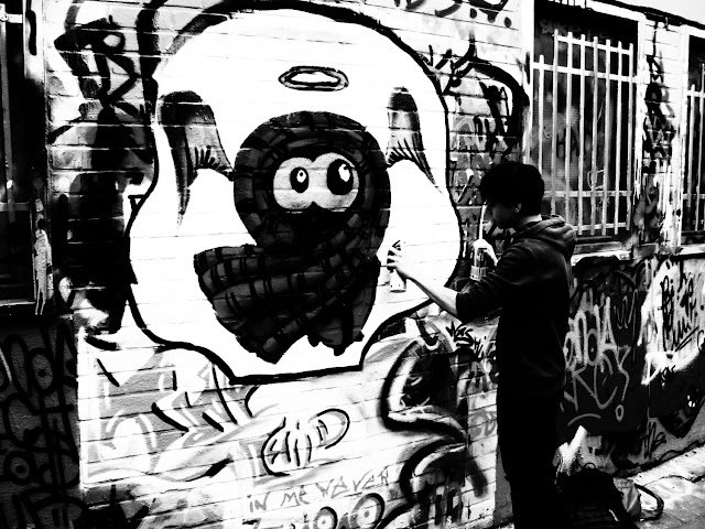
Black and white conversion and further curves applied.
When I compare the two images I find that the black and white version could still represent a true picture. It is maybe a little too contrasty but considering the amount of contrast that has been applied, it doesn't look too un-realistic. The colour version is quite obviously over processed - although this may not be wrong if this is what the artist desired. This over processing has affected the realism of the image, visible most prominently in areas we can relate too, such as the boy's skin tones. The colouring has rendered this image near to a piece of 'pop art'.

The second image has been given a low key effect by using curves to shift the brightness range into the darker part of the histogram. After the curves shift I have also used the exposure slider to shift the brightness further. In the black and white image I was able to add more exposure shift than in the colour version.

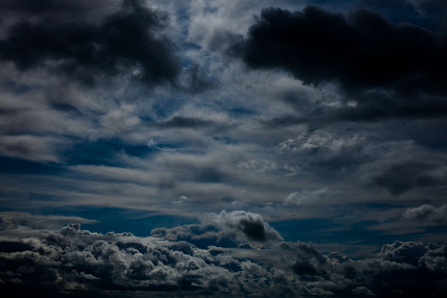
Using curves to shift the brightness range down the scale.
The further shift does also appear to have affected the contrast in the image. In particular compare the mid range exposure in the colour and black and white image. Once again the realism of the colour image has suffered whereas the black and white image does still seem 'real'.

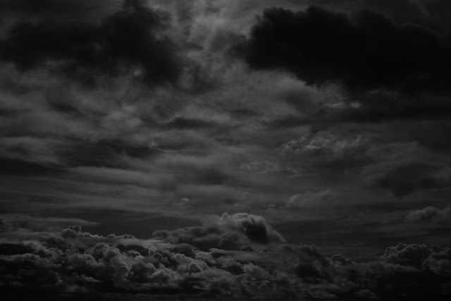
Black and white conversion with brightness range shifted.
Conclusion
I realised during this exercise that a big part of this learning process was actually in the selecting of suitable images which in turn will influence the choice of subject when shooting in black and white. Looking through all my images it was surprisingly difficult to find two that were right for this task. During the search I did try quick black and white conversions on many candidates and it was interesting to see the differences in the end results.

The second point raised by the exercise was that a black and white image can be processed to a higher degree than a colour one, without losing realism. I did indeed find this to be the case even if in this exercise I may have exaggerated the over processing a bit!

Finally, this exercise has highlighted that the black and white image is about shade, form and tone, properties that the colour in a colour image may distract from.