I am going to process two of my files, one that I feel suitable for a high contrast treatment and another for a high or low key treatment.
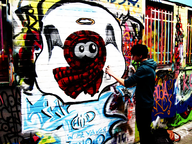
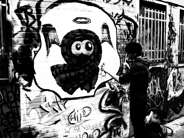
The first image of a graffiti artist in Belgium has been given a very high contrast treatment.This was achieved with curves in an 'S' pattern suggested by the work book. I set the contrast so high that we lose some detail in the darkest blacks, the artist's trousers, and also in the highlights. This is easiest seen in the artist's fore-arm.
 |
| A strong increase in contrast. |
 |
| Black and white conversion and further curves applied. |
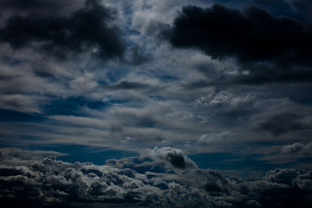
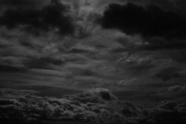
The second image has been given a low key effect by using curves to shift the brightness range into the darker part of the histogram. After the curves shift I have also used the exposure slider to shift the brightness further. In the black and white image I was able to add more exposure shift than in the colour version.
 |
| Using curves to shift the brightness range down the scale. |
 |
| Black and white conversion with brightness range shifted. |
I realised during this exercise that a big part of this learning process was actually in the selecting of suitable images which in turn will influence the choice of subject when shooting in black and white. Looking through all my images it was surprisingly difficult to find two that were right for this task. During the search I did try quick black and white conversions on many candidates and it was interesting to see the differences in the end results.
The second point raised by the exercise was that a black and white image can be processed to a higher degree than a colour one, without losing realism. I did indeed find this to be the case even if in this exercise I may have exaggerated the over processing a bit!
Finally, this exercise has highlighted that the black and white image is about shade, form and tone, properties that the colour in a colour image may distract from.