In the lead up to this assignment I have been looking at black and white work from other artists including Harry Callahan, Ansel Adams, Cecil Beaton and Henri Cartier-Bresson. Interesting to see the different subject matters covered in black and white.
Why I have chosen this subect
I have chosen as my subject the pier in Bognor Regis, my home town. I believe the pier offers many opportunities for textures as well as shape and form. Much more than this though, I also feel that the pier is suitable on another level. Most of the piers in England date from around the turn of the previous century. Black and white photography always raises this nostalgic feeling in me. I see a tie between the subject and the medium.
On yet another level, a pier and it's visitors in colour can be a happy and joyful place but when photographed in monochrome and in less than favourable holiday conditions and the emptiness can take on a melancholy atmosphere. This is what I am setting out to capture in the following images.
 |
| Clutter. |
 |
| Pier time. |
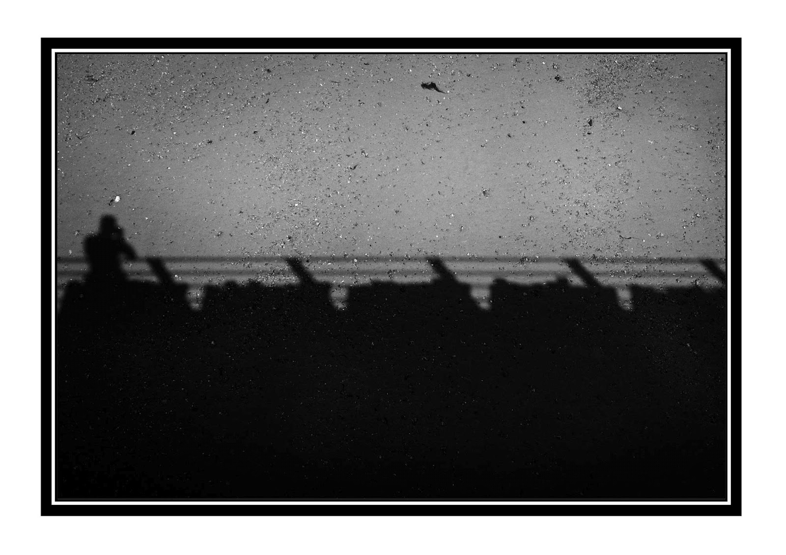 |
| My shadow. |
 |
| Walk the plank. |
 |
| Holiday spirit. |
 |
| Under the board walk. |
 |
| Wish you were here.... |
My objective was to show a moody, melancholy side of the pier. The pier is definitely moodier in black and white than when you look at the colour versions of the photographs. Looking at the images now, I feel that I have one very cliché image (it should be obvious which one!). Maybe the weather could have been a bit more 'moody' but I made several visits to the pier and in the end had to go with what I had captured.
I am quite happy with the processing. Black and white manipulation is something I haven't carried out often. There seemed to be a big craze in the last couple of years and I hate to follow the crowds, so I deliberately avoided this genre. This exercise forced me to experiment with black and white and I did enjoy it.
Picture details
Clutter. Canon EOS 5D MKII, 35mm Lens, 1/100 @F11, iso 50.
Pier time. Canon EOS 5D MKII, 35mm Lens, 1/250 @F8, iso 50.
My shadow. Canon EOS 5D MKII, 35mm Lens, 1/2500 @F2, iso 50.
Walk the plank. Canon EOS 5D MKII, 35mm Lens, 1/100 @F8, iso 50.
Holiday spirit. Canon EOS 5D MKII, 50mm Lens, 1/30 @F16, iso1000.
Under the board walk. Canon EOS 5D MKII, 50mm Lens, 1/160 @ F2.8, iso 1000.
Wish you were here. Canon EOS 5D MKII, 50mm Lens, 1/500 @ F5.6, iso50.
Finally, below are a small sample of the images that I took for this assignment.
 |
 |


